Merriam-Webster digital style guide
Company: Merriam-Webster
Role: UI, branding
Due to the small size and close-proximity of our team, Merriam-Webster had never had a robust inventory of all its design components prior to my tenure. Over the course of several projects, I worked to update the visual language for the site and apps. To document this evolution, I put together a comprehensive style guide.
I had several goals for our evolved visual identity.
I wanted to reduce the amount of visual clutter on our pages, improve the overall contrast of elements (with a mind towards accessibility), and provide us with a flexible foundation that we could build on top of for years to come.
I also wanted our team to be more mindful of a wider number of screen resolutions. Though we were in the practice of building and thinking responsively, middle break-points (like those visible on tablets) were often an afterthought. To accomplish this, I advocated for the adoption of the responsive Bootstrap grid. This has enabled our team to design and build across five clearly-delineated break-points in a more considered, focused way.
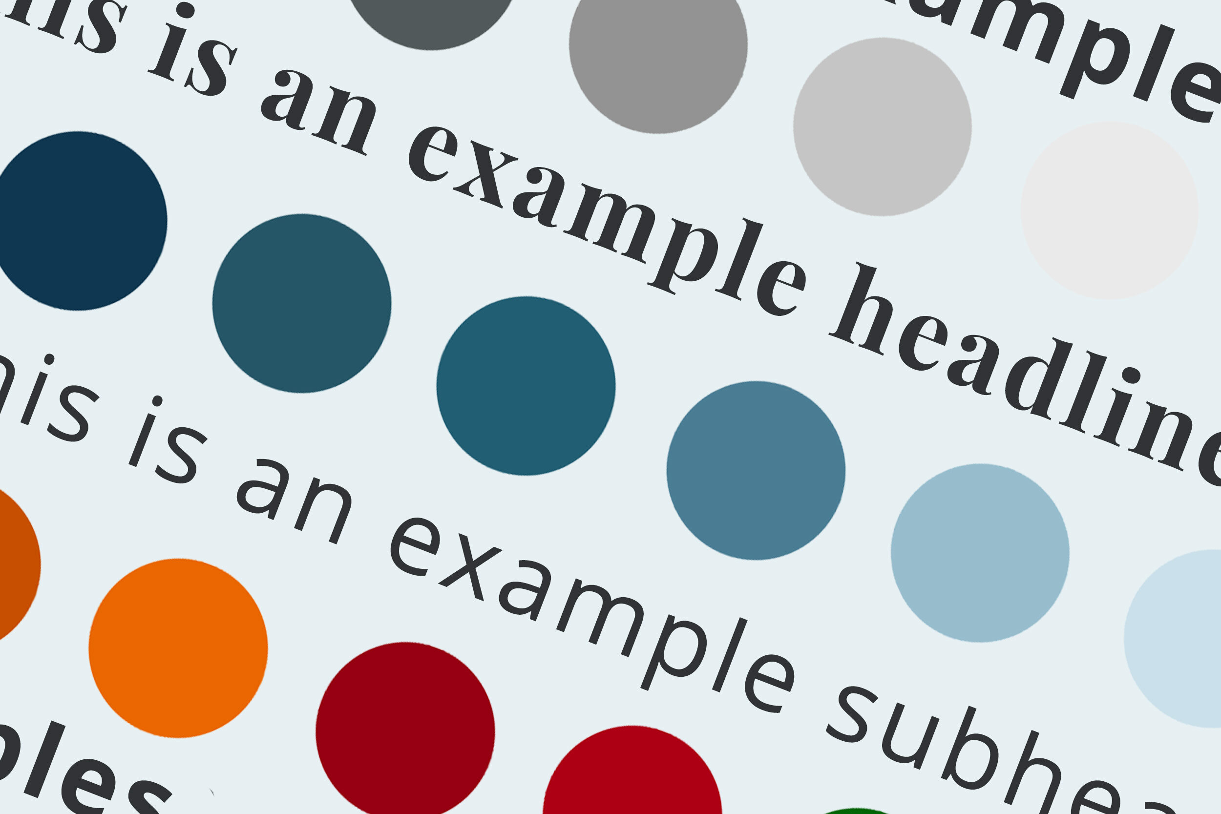
I consolidated the number of typefaces we used on the site, down to two from three.
Pages on merriam-webster.com that have been built around the new style guide score significantly better for accessibility metrics than pages that still use our old look/feel and grid.
The style guide has grown and evolved over time, but it continues to be an absolutely vital tool for our team. It has allowed design and development to work together more efficiently, improved my workflow as a designer, and helped us avoid duplicative work.


