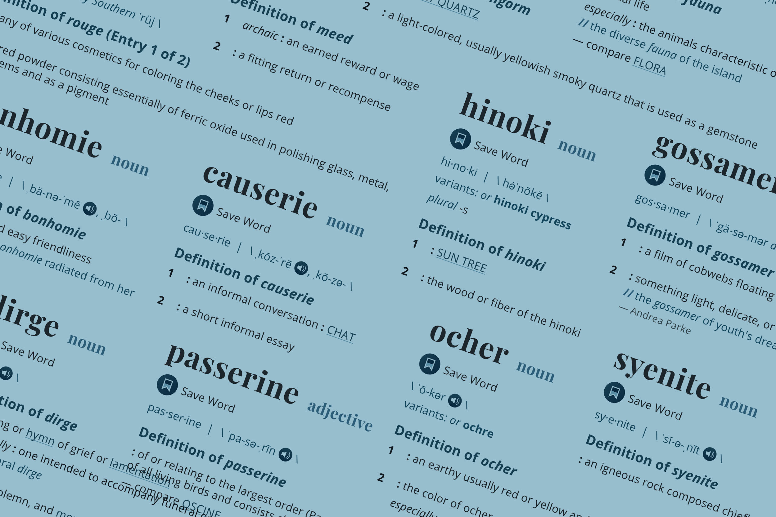
Merriam-Webster definition page redesign
Company: Merriam-Webster
Role: UX and UI, user testing
The pages that house Merriam-Webster’s definitions make up the vast majority of merriam-webster.com, and they’re responsible for most of the site’s traffic. We observed that the existing design for these pages was not doing all that it could to meet our users’ needs. We embarked on an effort to completely redesign them.
We sent out surveys and conducted extensive user testing throughout the design process. The final design clustered together the information that users find most useful and streamlined the page navigation to better allow for deeper engagement. In some cases, important information is now 50% higher up on the page than it was in the previous design. We created a more logical, simplified labeling system. We also optimized the UI with an eye to accessibility, focusing on more pronounced color contrasts and larger type sizes.
I worked very closely with our development team to improve page performance by reducing redundant CSS and consolidating our styles. We also created a better experience across all breakpoints by building these pages on the Bootstrap grid.
The redesigned pages have been a resounding success. We’ve seen increased engagement and awareness of the breadth of content Merriam-Webster has to offer.
You can see them in action here.


